
(Image source: NHL Media)
The National Hockey League’s 2025-26 season is officially underway and since June, we’ve seen a ton of teams release new uniforms, the most in a single campaign since the Reverse Retro 2.0 program during the 2022-23 campaign.
In total, 19 jerseys have been unveiled in recent months, with four more on the way later this season thanks to the Winter Classic in Miami and Stadium Series in Tampa Bay.
Of the 19 released so far, six are home & away (Boston, St. Louis & Utah), one is a new away jersey (Carolina), three are celebrate their respective Centennials (Chicago, Detroit & New York R), six are new alternates (Edmonton, Los Angeles, Ottawa, Pittsburgh, Seattle & Washington), while the other three are to celebrate anniversaries (Colorado – 30th anniversary; Minnesota – 25th anniversary; San Jose – 35th anniversary).
Let’s dive in and take a look at all 19 jerseys released, starting off with some fresh “new” sweaters for the Boston Bruins.
Boston Bruins
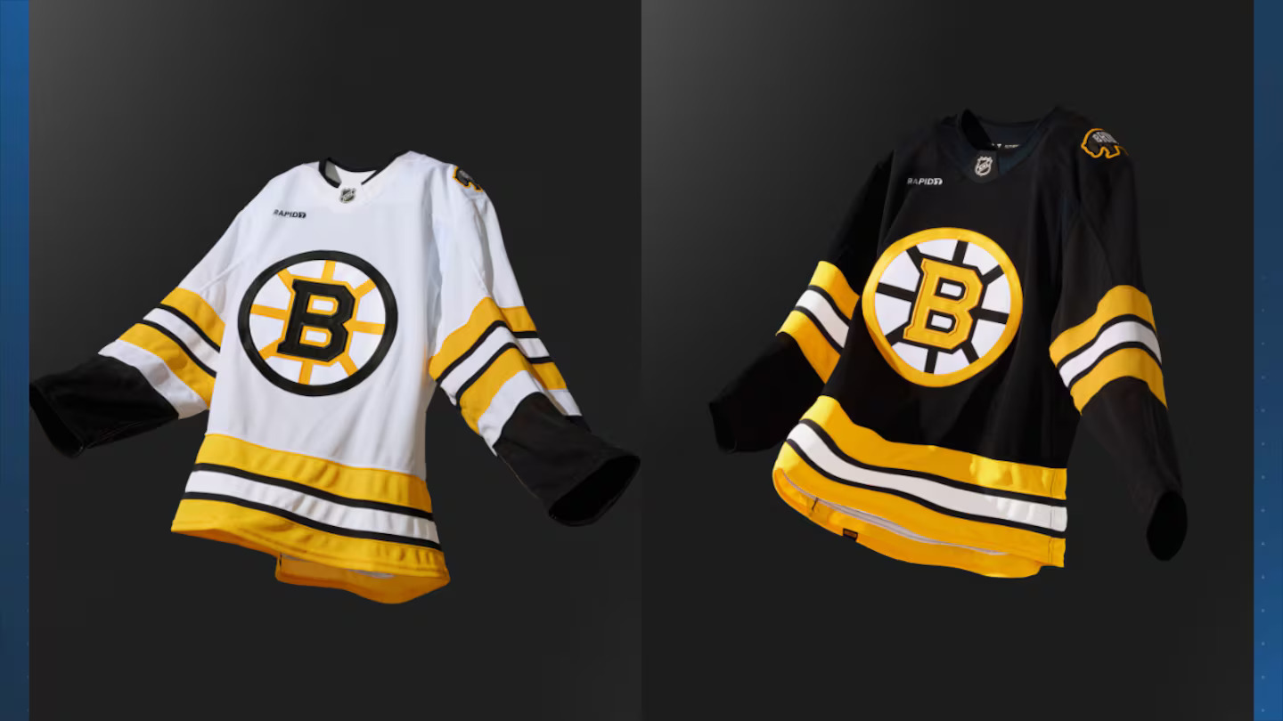
(Image source: Boston Bruins/NHL)
As crazy as this might sound, the Boston Bruins have worn THREE different sets of home & away jerseys in the last three season. During the 2023-24 campaign, they celebrated their Centennial. Last year, they reverted to their previous jerseys before the Centennial and now this season, the club is going with a retro look permanently.
Drawing elements from their from the 1970s to mid 1990s, the Bruins have gone full retro for their new sweaters. Two different Spoked B’s, exactly like they had during their Stanley Cup championships in 1970 and 1972, with the only real difference being the introduction of a new shoulder logo featuring a bear that says “Bruins” inside. I wouldn’t be shocked if that logo is used in some way for the 2026 Stadium Classic.
Carolina Hurricanes
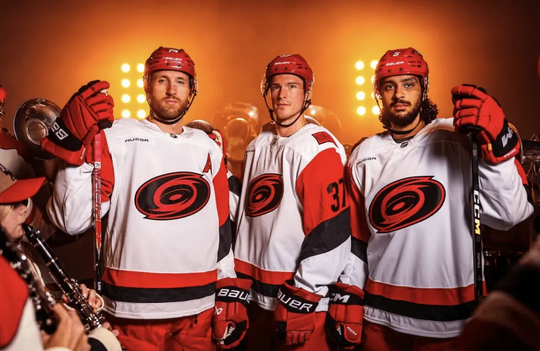
(Image source: Carolina Hurricanes/NHL)
One team that was in desperate need of a refresh for their away uniform was the Carolina Hurricanes following six years of their white sweaters featuring “CANES” diagonally on the front.
For the first time since the 2018-19 season, the Hurricanes’ primary logo returns to the front of their away sweaters, but with a bit of a twist. The logo is done in a two-toned colour scheme – red and black, and is the exact same logo worn on their 2023 Stadium Series sweaters.
Personally, I’m a big fan of the jersey, especially the striping on the sleeves & bottom, as well as the numbering and font used for the players names. However, the logo just doesn’t work, in my opinion. I feel like the team’s ACTUAL primary logo would be a much better fit.
Chicago Blackhawks

(Image source: Daily Faceoff)
The Chicago Blackhawks are one of three teams celebrating their Centennial season this year, which you think would mean the club would release a throwback to commemorate the occasion. Well, the Blackhawks did – sort of.
Chicago’s home uniform, for this season only, features a gold/tan outline on their logo, which is something they wore from 1959 to 1999. Along with the logo outline, the only other major change is to their colour, which features no white like their normal home uniforms, which return next season, other than the laces.
While it is a nice nod to the past, I feel like the Blackhawks did the bare minimum with their Centennial sweaters and had so many other options they could’ve gone with, perhaps even their red, black and white barber pole uniforms worn by the club between 1937 and 1955.
Colorado Avalanche
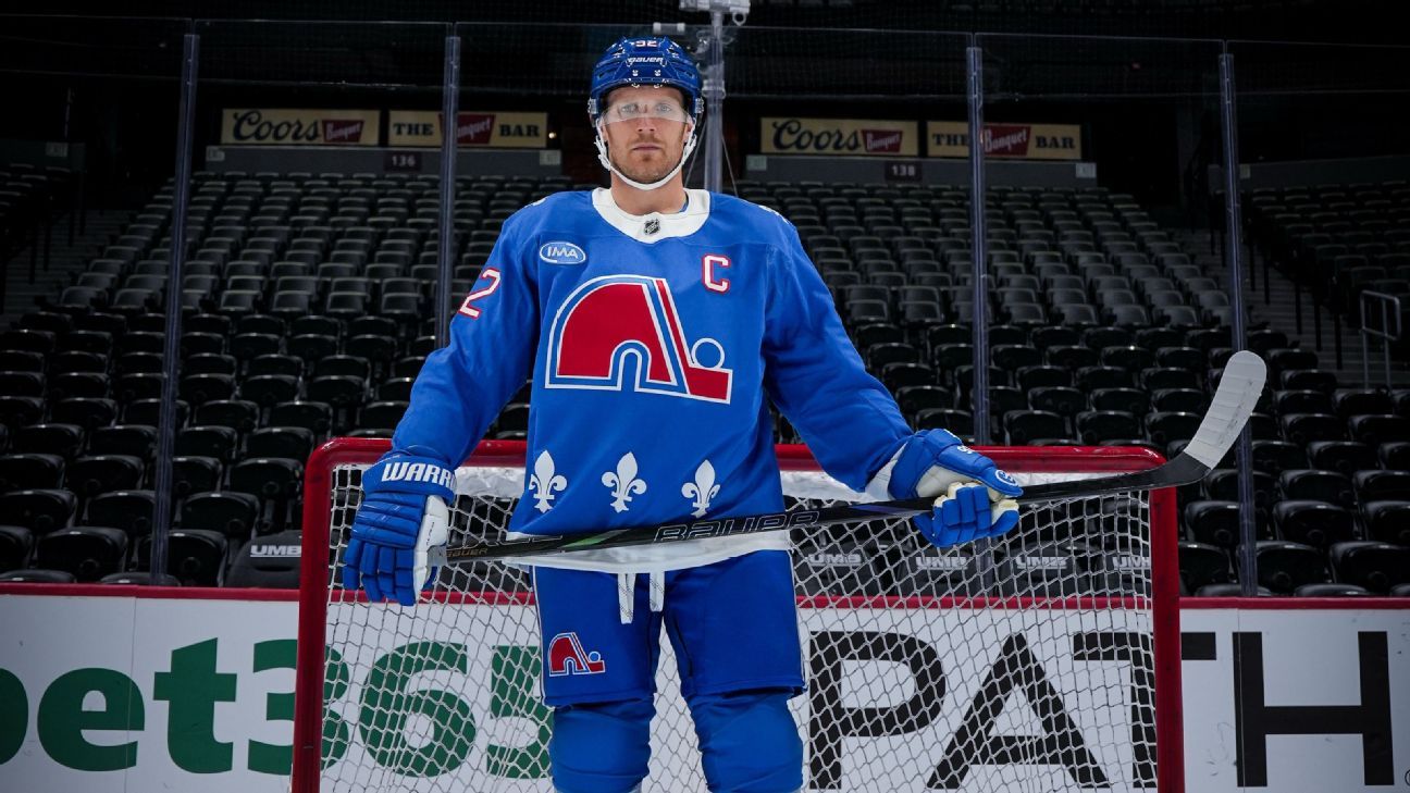
(Image source: Colorado Avalanche/NHL)
The Colorado Avalanche are celebrating their 30th anniversary in Denver and to commemorate their relocation from Quebec City, the organization will be donning Nordiques throwbacks for seven games this season, starting tonight against the Carolina Hurricanes, who will be wearing their Hartford Whalers jerseys.
Colorado will also be wearing these jerseys next month against the Montreal Canadiens, which will mark the first time Habs & Nordiques sweaters will hit the ice against each other in an NHL game since April 26th, 1995.
There are mixed feelings about this on social media, with some in Quebec, understandably, feeling hurt by seeing their beloved Nordiques sweaters back on the ice, but not in Quebec City. The pain is still there after all these years, for good reason. No one wants to see their team get relocated. For me, I do understand that there will be some angry by this decision, but I also believe this is a great way for the Colorado Avalanche to honour the franchise’s past.
Other than it being worked into the Fanatics style, there are zero changes to the sweater worn by the Quebec Nordiques from 1991-1995, when they added a red outline to their numbers. It’s a great throwback and might even be the best uniform released for the 2025-26 season.
Detroit Red Wings

(Image source: Detroit Red Wings/NHL)
The second of three teams to celebrate their Centennial season in 2025-26 is the Detroit Red Wings, who in my opinion, knocked it out of the park with their sweaters.
Detroit’s Centennial uniforms draw inspiration from various points throughout their history. The chain-stitched logo from their very first season as the ‘Red Wings’ in 1932, striping from their time as the Detroit Falcons (1930-1932) and the brown captain’s patch from the 1950s.
Accompanying the sweaters are leather-like brown gloves, pants featuring the Detroit Cougars’ logo and a matte red helmet with a vintage Meijer logo that the grocery store chain used between 1957 and 1966.
The Red Wings will be sporting this sweater for more than a dozen times throughout the 2025-26 season and I personally would love to see them keep it around as a full-time alternate jersey going forward.
Edmonton Oilers
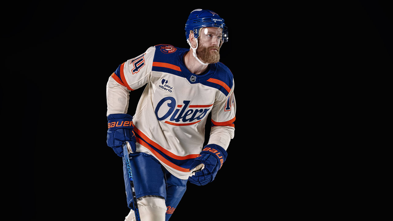
(Image source: Edmonton Oilers/NHL)
After a one-year absence without an alternate jersey, the Edmonton Oilers unveiled a brand-new cream coloured sweater that’ll be worn for seven games this season.
Edmonton’s new alternate jersey features a cursive “OILERS” wordmark on the chest, with the S made to look like an oil drop, a blue shoulder yolk with a thick orange stripe going through the front, with blue and orange stripes on the bottom of the sweater, as well as the sleeves.
There isn’t much to say about this uniform. It’s not bad, but it isn’t great in my eyes. It’s certainly an upgrade over their last alternate jerseys, the two-toned navy and orange ones worn from 2019 to 2024, but Edmonton could’ve gone in several different directions with this, even if their goal was to create something original.
Los Angeles Kings
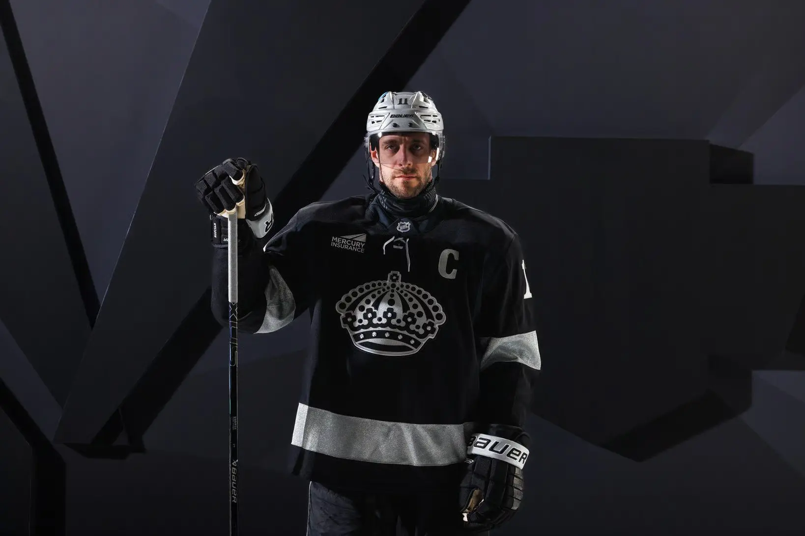
(Image source: Los Angeles Kings/NHL)
After rumors of a new alternate jersey in the works, the Los Angeles Kings unveiled theirs ahead of puck drop on their season opener back on Tuesday, October 7th against the Colorado Avalanche.
The Kings skated onto the ice for warm-ups in their normal home jerseys, but as the players were introduced to fans in attendance at Crypto.com arena, the club was sporting brand-new alternates which featured a crown as the primary logo for the first time since their Reverse Retro 2.0 sweaters.
Los Angeles’ uniform is primarily black, which didn’t sit well with some fans given that it’s already their main colour of their home jerseys. A thick shiny silver stripe is seen on the sleeves and the bottom of the sweater and a new gray helmet was introduced to go along with the new alternate.
Minnesota Wild
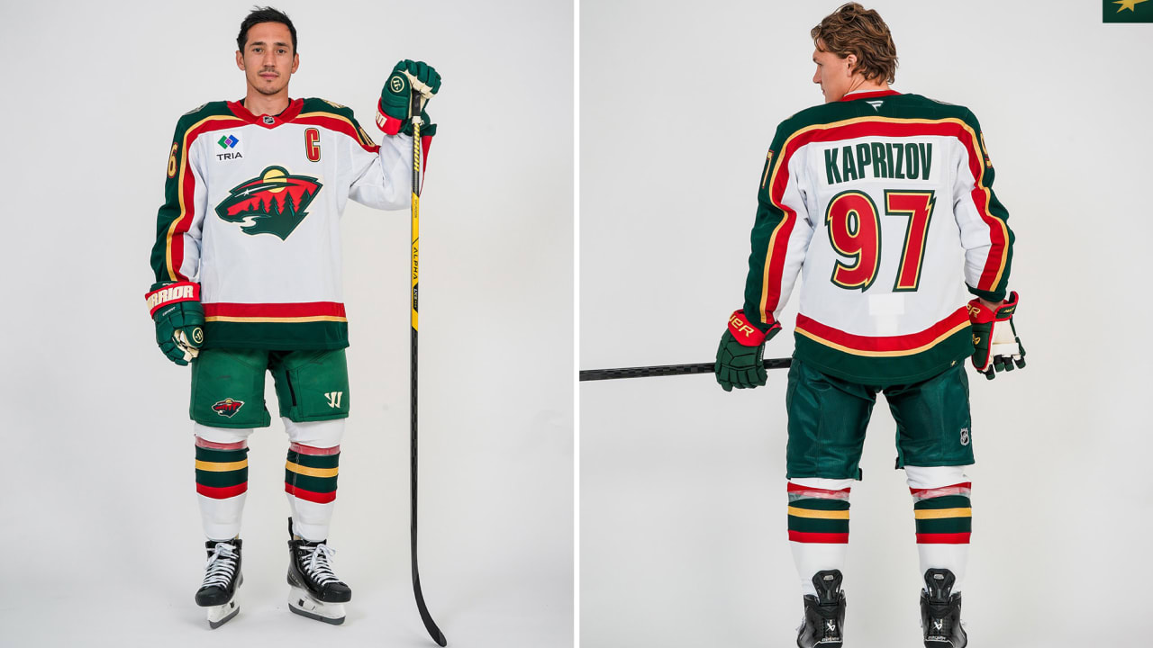
(Image source: Minnesota Wild/NHL)
The Minnesota Wild are celebrating their 25th anniversary in the National Hockey League and are doing so by throwing it all the way back to their very first white uniform, which was a big hit among their fans.
The anniversary jersey has all the same features from the original ones worn from 2000 to 2007 from the colour scheme, the striping, the font/colour of the font for the name plate and the jersey numbers.
If you’re going to do a throwback/anniversary jersey, this is the way to do it. No small additions or subtractions to make it “modern”, keep it all the same and fit it into the Fanatics template, like the Wild have done. The only shame is that this sweater will only be worn for a total of four games.
New York Rangers
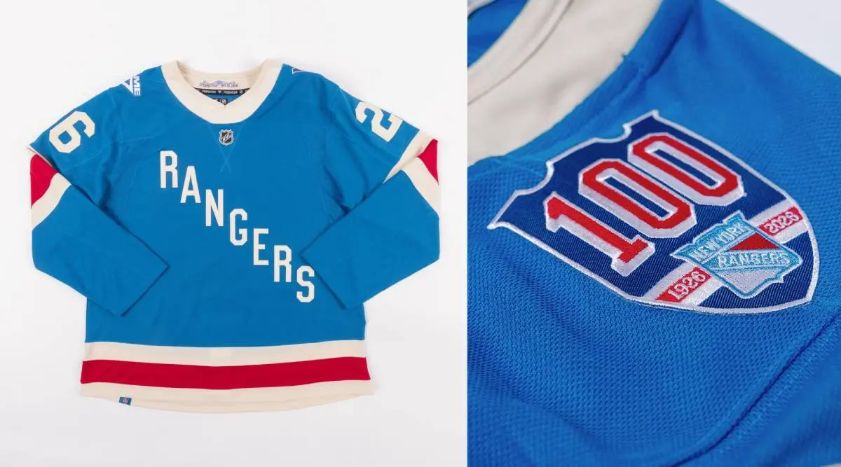
(Image source: Daily Faceoff)
The New York Rangers are throwing it back all the way to 1926 for their Centennial jerseys and aside from the Quebec Nordiques throwback, these are my favourite uniforms released by any club in the National Hockey League this year.
New York has gone with a lighter blue, like they wore in 1926, with their single-toned white diagonal ‘RANGERS’ wordmark, along with off-white/cream and red striping. The Rangers first wore these sweaters this season in their home opener on October 7th against the Pittsburgh Penguins.
My only qualms I have about the Rangers’ Centennial sweater is that the club opted to go with red pants and white/red/blue gloves over brown for both, which is what they wore 100 years ago. Other than that, they’re perfect and like I said about Detroit’s, I would love to see the Rangers keep these around as an alternate.
Ottawa Senators
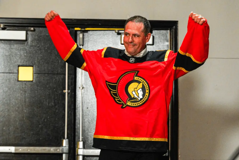
(Image source: Ottawa Senators/NHL)
For the first time since their first Reverse Retro jersey, the Ottawa Senators have a red sweater back in the rotation with the introduction of a new alternate before the 2025-26 season began.
The red on this sweater really pops, and looks great on the ice as well, with the club wearing it twice thus far. The shiny gold, much like the home sweaters of the Vegas Golden Knights, go really well with this shade of red, to the point where I almost wish there was more of it, instead of such thick black striping.
The only issue for me with this sweater is the shoulder yolk. It looks really awkward, almost like they should have extended the black and gold further than what it ended up looking like. It’s a solid alternate and Senators fans seem to really love the fact that the club has introduced a new red sweater.
Pittsburgh Penguins
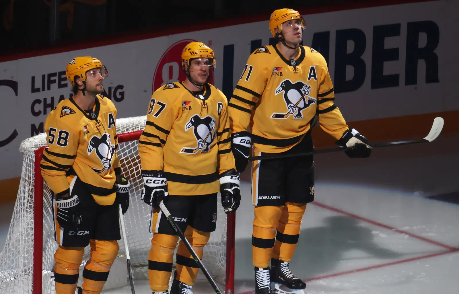
(Image source: Charles LeClaire – Imagn Images)
Much like their Expansion cousins, the Los Angeles Kings, the Pittsburgh Penguins opted for a “surprise” unveiling of their new gold/yellow alternate jerseys.
Pittsburgh has worn all-gold/yellow sweaters on several occasions throughout franchise history, the first time being in 1980, with the introduction of a new jersey that would be worn for select home games before it became their exclusive home uniforms in 1983-84 before disappearing.
The Penguins would go another 33 years before donning an all-gold/yellow jersey again, which they did during the 2017 Stadium Series. Pittsburgh then brought that Stadium Series sweater back, with some slight alterations, for their full-time alternate from 2018 to 2021.
These uniforms unveiled by the Penguins are solid, especially with the gold/yellow helmet as well, but it didn’t go over too well with some of their fan base that was hoping for the return of the Robo Penguin.
St. Louis Blues
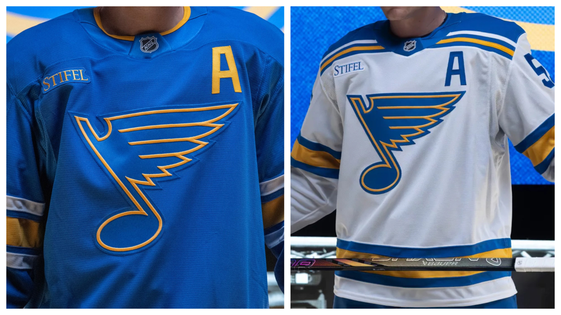
(Image source: St. Louis Blues/NHL)
The St. Louis Blues unveiled new home and away jerseys just days before the 2025 NHL Entry Draft, going with throwbacks along with a new logo on the front.
If these uniforms look familiar to you, well, they should. The blue home uniform has been worn as an alternate for a number of years now, albeit with some small changes, after being introduced at the 2017 Winter Classic. It’s a direct nod to the jerseys worn by the Blues when they first entered the NHL in 1967, but with a lighter shade of blue.
As for the white road uniform, they first wore those – but with cream as the base colour – at the 2022 Winter Classic. It was a big hit among the fan base that the club decided to bring them back as their full-time away sweaters starting this season.
For those fans who were a big fan of the Blues’ home jersey worn last season and introduced in 2014, those are sticking around as an alternate this year. The club announced earlier this fall that they’ll be wearing their old home uniforms as alternates for ten games this season.
San Jose Sharks
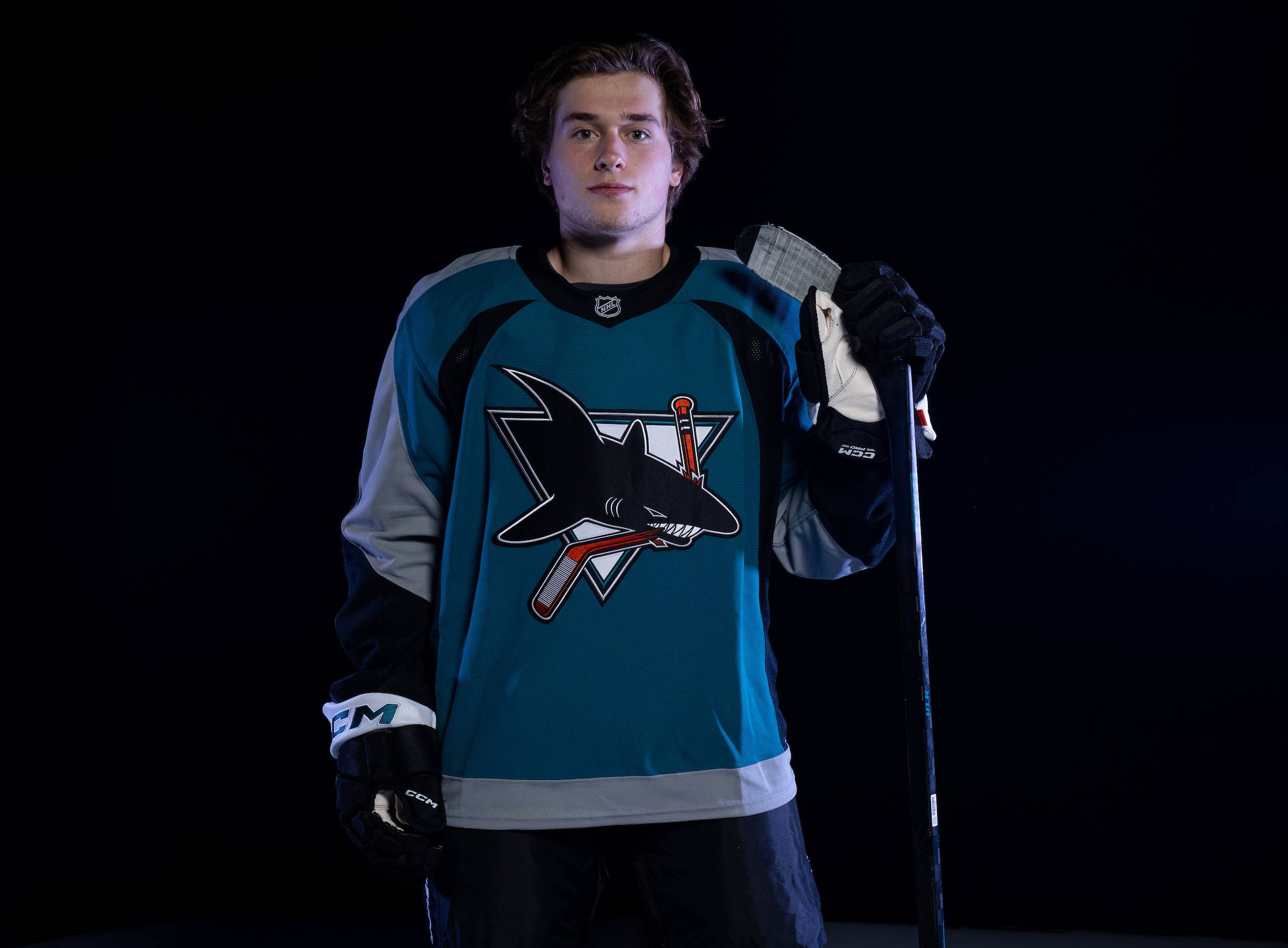
(Image source: San Jose Sharks/NHL)
Another club celebrating an anniversary during the 2025-26 campaign is the San Jose Sharks, who have had some of the best jerseys ever since they entered the National Hockey League in 1991.
The San Jose Sharks are honouring their past this season with a direct throwback to their teal jerseys worn from 1997 to 2007, a decade in which the club made the Stanley Cup Playoffs an impressive eight years.
As is the case most of the time with these anniversary jerseys, they’re only worn on a handful of occasions, with the Sharks sporting theirs a total of four games this years, the first being Thursday, October 30th against the New Jersey Devils.
Seattle Kraken

(Image source: Seattle Kraken/NHL)
For the first time in franchise history, the Seattle Kraken have unveiled an alternate jersey after participating in the second Reverse Retro series in 2022-23 and hosting the Winter Classic at T-Mobile Park in 2024.
Seattle’s first alternate sweater is all black, with a red stripe on the sleeves and hem and some elements of the jersey even glow in the dark, something we first saw in the National Hockey League with the Vegas Golden Knights and their Reverse Retro 2.0 uniform.
The Kraken’s alternate jersey will make its on-ice debut on Saturday, November 1st when they welcome the New York Rangers to town and as much as I do like this, I’m going to reserve full judgement until I see it in game action – with the glow in the dark during pre-game too.
Utah Mammoth
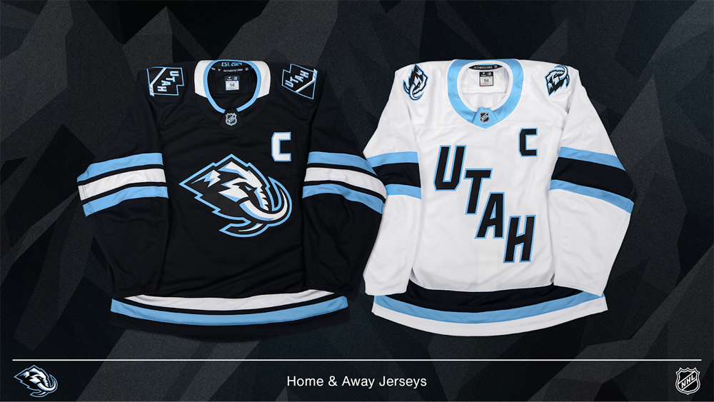
(Image source: Utah Mammoth/NHL)
After going with the moniker “Utah Hockey Club” last season following their non-traditional relocation/expansion from Arizona, the organization finally unveiled their name back in the early part of the offseason – Mammoth.
Following a fan vote and some legal issues which held them back from going with “Yeti”, the club decided on Mammoth, with a slick logo featuring the head of Wooly Mammoth, which lived in the state of Utah during the last Ice Age. The primary logo is officially called “Mountain Mammoth” by the club with the snow-capped Wasatch Mountains featuring prominently with the Mammoth head on the home jersey.
As for their away sweaters, the Mammoth organization is keeping it the same, with a diagonal “UTAH” wordmark, with a new font and the team’s primary logo featuring on both shoulders. As the club mentioned when going through the design/naming processes, they would be keeping their colour scheme the same – Rock Black, Mountain Blue and Salt White.
Personally, I really hope we get to see a uniform in the coming years, whether it be an alternate or for an outdoor games, with Mountain Blue as the primary colour.
Washington Capitals

(Image source: Washington Capitals/NHL)
The final team we’re looking at today is the Washington Capitals, who are bringing back their “Screagle/Screaming Eagle” logo on a primarily red uniform.
Washington first introduced the Screaming Eagle logo ahead of the 1995-96 season when the club rebranded to blue, bronze, black and white from their original colours. The Capitals wore the Screaming Eagle on their jerseys until 2007 when they decided to unveil a new look under the Reebok Edge template.
The Capitals are one of only a few teams in the NHL that still have the same uniform design from the Reebok Edge era and with the organization desperately in need of a rebrand and the fan base loving the Screaming Eagle logo/jerseys, it wouldn’t shock me in the slightest if this becomes their home sweaters in the years to come, with a white version being introduced for the road.
Still to Come
And just like that, we’ve gone through all 19 new jerseys introduced by teams around the National Hockey League since the spring and in the coming months, a handful of more will be unveiled, starting with the Florida Panthers and New York Rangers for the 2026 Winter Classic, followed by the 2026 Stadium Series between the Tampa Bay Lightning and Boston Bruins.
While not directly linked to the NHL, we’ll also get a look at uniforms worn by all 12 participating nations at the 2026 Winter Olympics in Milan, Italy. There’s no definite date for when those will be unveiled, but don’t be surprised if it’s around the same time rosters are announced, which is some time in early January.